Contrary to popular belief, numbers can’t always speak for themselves. Numbers can have an important story to tell, but how we present them is the difference between effective communication and confusion . . .
Jumping to conclusions: How to use subconscious associations to communicate more effectively

The human brain is a wondrous and efficient thing. It’s always looking for ways to cut corners and process information quickly.
If you’re a clever communicator, you can take advantage of the brain’s inclination to jump to conclusions. For example, if you place things close together, your reader’s brain will assume they’re connected in some way. This association happens subconsciously without the reader actually thinking about it.
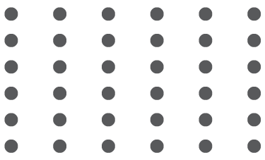
Let me demonstrate using the following series of dots. They’re spaced evenly — there’s nothing about their placement that suggests any sort of association between them.

By moving the dots closer together horizontally without changing the vertical spacing, the brain subconsciously decides that the dots that are closest to each other much be related. It assumes they’re rows of dots.

If, instead, we move the dots vertically closer without changing the horizontal spacing, the brain decides they are columns of dots.
Isn’t that interesting?
Let’s try something else. What happens if we move some of the dots away from the rest of their pals?

The simple addition of a bit of space creates the impression that we have two separate groups.
But what does any of this have to do with effective communication? If we look back at the examples from our last blog post, they’re actually a pretty good illustration of how these principles work with words, not just dots.
We started with a simple piece of text intended to advertise a musical performance. When all the words were the same size, and there was no spacing to distinguish between the different types of information, it was all one big block of uninviting text.

However, when we introduced some space around the different types of information — the name of the performers, the time and location, the description — these distinctions immediately became apparent.

This is not complicated design at work here. We used proximity and white space to help the brain jump to the conclusion that the words that were closer together must be in groups and that they must be related. The reader didn’t have to consciously think about it.
Clear-design principles make it easier for readers to understand your message, so you communicate more effectively. It’s a win-win.



Comments (0)