The human brain is always looking for ways to cut corners and process information quickly. If you’re a clever communicator, you can take advantage of the brain’s inclination to jump to conclusions . . .
What do your numbers have to say for themselves? Tips for presenting clear and persuasive numeric data

Contrary to popular belief, numbers can’t always speak for themselves. How we present them is the difference between effective communication and confusion.
The numbers 6, 20, and 1975 don’t mean anything on their own. However, if I add some context, they get a lot more interesting. For example, if I tell you that Angelina Jolie was born in 1975, married Jonny Lee Miller when she was 20, and has 6 children with Brad Pitt, those numbers suddenly have meaning and are a lot more interesting.
Numbers can have an important story to tell, but it’s up to us to help them tell it. Following are some simple tips to help you present numeric information so that it emphasizes what’s important.
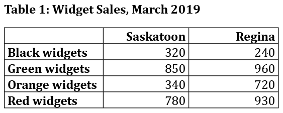
Start by organizing the data in a logical order. In the following table, all of the data is there, but the reader has to work to figure out where the real story is.

According to Sally Bigwood, one of the authors of The Designer’s Guide to Presenting Numbers, Figures, and Charts, the golden rule is “always present data for the convenience of the reader.”
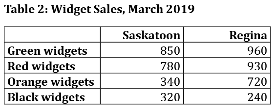
So let’s help readers of this table see where the high and low points are. Table 1 is organized by alphabetical order of the categories. If we arrange the data by quantity of sales instead, a more compelling story begins to appear.

Arranging data by size helps the reader make comparisons and reveals patterns and exceptions. For example, in Table 2, the reader is more likely to spot the significantly higher sales of orange widgets in Regina than in Saskatoon, and the fact that only black widgets sell better in Saskatoon than in Regina.
The most common arrangement is largest to smallest. Usually, the larger the number, the more important the item is.
Besides, when you arrange data from largest to smallest, it’s easier for people to subtract the smaller number from the larger one above it and figure out the difference between them.

Why make your readers waste time trying to figure out what the numbers mean, when they could be spending that time doing something with the information?


Comments (0)